Somehow,
composition is the deliberate combination of a scene's distinct parts to make a whole with more meaning than the simple juxtaposition of these parts. You will find below my modest contribution with some guidelines that hopefully may help you achieve this goal. But such rules are made to be transgressed, and non-standard creativity can also produce great shots…
Horizontal Frame
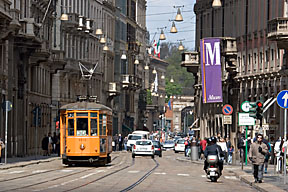
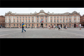
The 3/2 horizontal frame of SLR cameras has been successful for years, maybe because it approximately fits the human normal binocular field of view (about 180° horizontally & 120° vertically). It has its own dynamics; our culture makes us read such an image preferably from left to right (past to future). This framing represents 70% of my photography.
The side image depicts the human normal binocular field of view, roll your mouse over it to reveal an inlaid 3/2 photo.
Vertical Frame
A vertical subject will best fit in a vertical frame, and it just so happens that a common vertical subject is the human being… A vertical image does have some vertical dynamics (up or down depending on the composition), but also to a lesser extent a left to right orientation. An isolated portrait will be generally perceived to look left into the past, and right into the future. This framing represents 20% of my photography.
Square Frame
"Thou Shalt Not Crop" seems a bit obsolete nowadays with all our pixels. I hope my sin is half forgiven as I try to think of the final frame as soon as looking into the viewfinder... The square frame is very neutral, even intimate without any intrinsic dynamic. It is the actual composition (visual guides, symmetries) which strengthens the content; and centered subjects are more readily welcomed. This framing represents 8% of my photography (rising), notably some tight portraits.
Roll your mouse over the picture to crop and click the link for more square photos.
Panoramic Frame
Skylines, wide buildings or architectures, uninteresting skies or foregrounds: the panoramic frame has its rationale.
Image stitching is of course a possibility, but the 5D Mark II pixels associated with an Ultra-Wide-Angle lens calls upon the cropping sin... This framing represents 2% of my photography.
Roll your mouse over the picture to crop and click the link for more panoramic photos.
Rule of thirds
You're generally better off without centering (your subject, the horizon), except to highlight a symmetrical view. It is often recommended to stay approximately aligned with imaginary lines that divide your image in thirds (for the horizon or a wall), and to put the main subject at their intersections.
Roll your mouse over the picture to reveal those lines.
Beware, the eye is very critical against small horizontality or verticality discrepancies around the subject and compared to the borders of the image. At worst, such a bad framing can generally be corrected in post-processing.
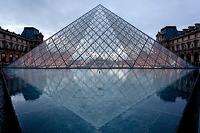
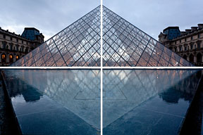
Symmetry
Centering your subject to emphasize symmetries along one or several axis is a notable exception to the rule of thirds. To be effective, the centering must be perfect. A common example is a reflection.
Roll your mouse over the picture to reveal the symmetry axis.
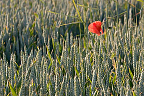
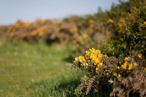
Contrast
A key to a powerful image is a subject that has one or more contrasts with the rest of the image; for instance:
complementary colors, saturated/pastel, light/shade, sharp/blurred, dot/line, large/small, few/many, straight/bended, vertical/horizontal, circular/diagonal, area/line, smooth/coarse, mobile/still, light/heavy, transparent/opaque, liquid/solid, strong/weak, rich/poor, etc.
Roll your mouse over the picture to reveal the real subject which was concealed for the sake of demonstration.
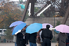
Attracting attention
To improve readability, lines or curves are welcome to lead the onlooker's gaze toward your main subject. Diagonals are more dynamic than horizontals (stability) or verticals (balance). Those lines may even be imaginary: the direction of a gaze, from shadow to light, from blurred to sharp, etc.
Roll your mouse over the picture to reveal such lines.
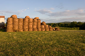
Maintaining focus
It is good practice to leave some space around elements that may lead the onlooker's gaze outside the image. A picture is easily ruined with your human subject looking towards the border, or an inappropriate object being cut.
Roll your mouse over the image to remove the half barn.
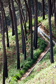
3D: perspective
Rendering 3D perception on a flat screen or paper is fortunately possible as our brain has more than one trick available to that effect. The easiest one is perspective where distances are deducted from the convergence lines while we imagine the object as simple and even as possible.
Without talking about stereoscopic 3D movies, I just wish to mention that a movie tracking shot will induce excellent distance information through the increasing pace perceived from background to foreground, as well as the slow perspective modifications. Just try in a corridor to open and close one eye, first motionless and then moving forward: monocular vision is not that flat when moving!
Back to perspective: don't forget changing your position to help find the appropriate shooting angle before triggering (as zooming does not change perspective at all), and close one eye while standing still to evaluate what a picture could look like.
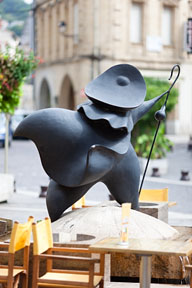
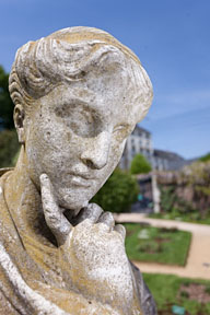
3D : portrait
For a portrait,
as zooming does not change perspective at all, relative proportions of the different parts of the face will only be determined by the shooting distance. If it is short, the nose being closer to the lens will be rendered bigger than the ears. The side image was shot at about 3 m (10 feet); this human sized statue is very nicely proportionned. Roll your mouse for the same picture taken at arms length
selfie distance.
As a rule of thumb, unless the subject has a very small nose like a child, avoid shooting adults at less than about 2 m (6 feet) to maintain well balanced face lines.
3D: depth of field
After 4 years in APS-C, I finally recovered depth of field control with the EOS 5D Mark II full frame format. This is especially noticeable with light fast prime lenses like the "normal" 50 mm f/1.4.
A low contrast composition where the subject is lost in the background may become interesting with a shallower depth of field (perspective suggested through sharpness gradations between foreground, subject and background).
Roll your mouse on this 50 mm f/10 image for an f/1.4 version.
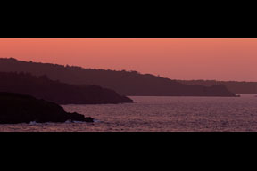
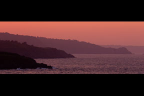
3D: tone gradients
In some cases, we also deduct distance information from tone gradients: dark to light diffuse tones (atmospheric haze), warm to cool colors (high sun), cool to warm colors (low sun).
The side image has been over contrasted to reduce its tonality gradient. Roll your mouse to reveal the depth of the original.
3D: higlights and shadows
Slightly lateral diffuse lighting will create modeling shadows to your subject which help reveal its relief. A slightly cloudy sunny day is ideal for the right amount of shadow softening. For more on lighting, don't miss my "
Cobra Flash Tips and Tricks"...
Shadows from this image were over softened. Roll your mouse to reveal the original modeling effect.
Gestalt psychology
A number of repeating items in an image tend to be perceived as a global simple and stable shape according to "
gestalt psychology".
Roll your mouse over the image to reveal an induced line that leads the onlooker's gaze towards the top of the dome.
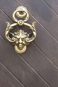
Less is often more
Without going as far as
minimalism, it is good practice to reduce distractions in your compositions by moving closer, concentrating on atmosphere and leads to your subject.
For this devilish knocker, I believe I found a good compromise between a detailed close-up and a picture of the whole door. Following the lines from left to right will carry us with the devil deep down the earth...
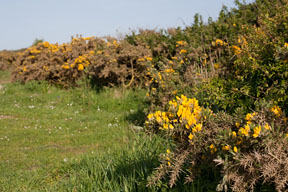
Patterns
Filling your image from edge to edge with repeating patterns creates a feeling of large quantities extending well over the actual frame. Patterns may be regular like well ordered pearls or irregular like rain on a window. They usually make good backgrounds, that's why you should break the pattern by a contrasting irregularity identifying the actual subject.
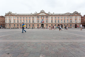
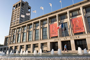
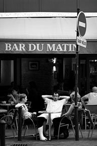
Second look
A second, slightly hidden subject will extend your audience's attention by forcing alternate interpretations of your image.
Reading from left to right this picture of Le Havre's town hall will slowly lead the onlooker's gaze toward the young boy, who is resolutely walking to the right, that is to say his future...
Black & White
It is worth converting an image to black & white when it has little hue variations, or when the color information is relatively useless or even detrimental to your message. This allows greater contrast control through post-processing, increasing tenfold your composition power. Using Photoshop Camera RAW or Lightroom, you can selectively adjust the level of grey associated with eight different colors (the old colored filters from film times), and then globally increase contrast with the curve tool well over what would be acceptable on a color image. Adding some slight
deliberate vignetting may help to further concentrate the onlooker's gaze towards the centre of your image.
Roll your mouse over the image for a black & white interpretation and click the link for some more examples.
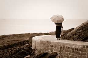
Split Toning
In some cases, color
split toning may further increase an atmosphere. Using Photoshop Camera RAW or Lightroom, the "Split Toning" tab will let you selectively adjust hue and saturation for highlights and shadows. I suggest starting with saturation sliders set to maximum for highlights and minimum for shadows allowing precise color selection for highlights, then similarly selecting the color for shadows and finally fine tuning both saturation sliders.
Roll your mouse on the image for a "Sepia" split toning.